Leading digital teams in solving challenges that matter.
Let's talkPayman
Khodabandehloo
Product and Process Innovation, Design Excellence
Delivering solutions for clients such as...


Featured Work
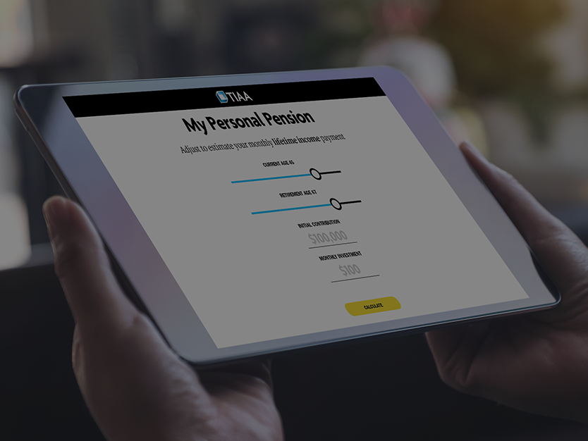
TIAA
Digital Advice Tools
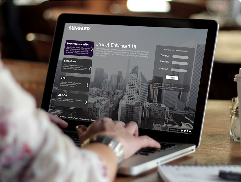
Sungard
Comparison Systems
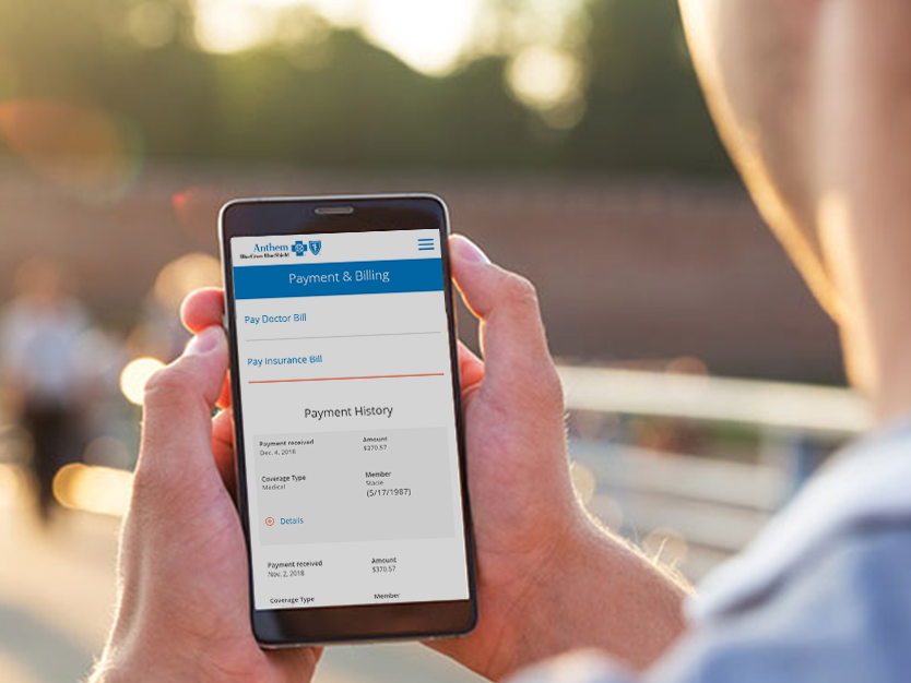
eDocs
Self-Service App

Choose One
E-Commerce
ChooseOne is a civic minded brand that brought its products and message online integrating eCommerce and Social Media.
Approach
Digital starts out physical. Design space needs physical space in which to find itself.
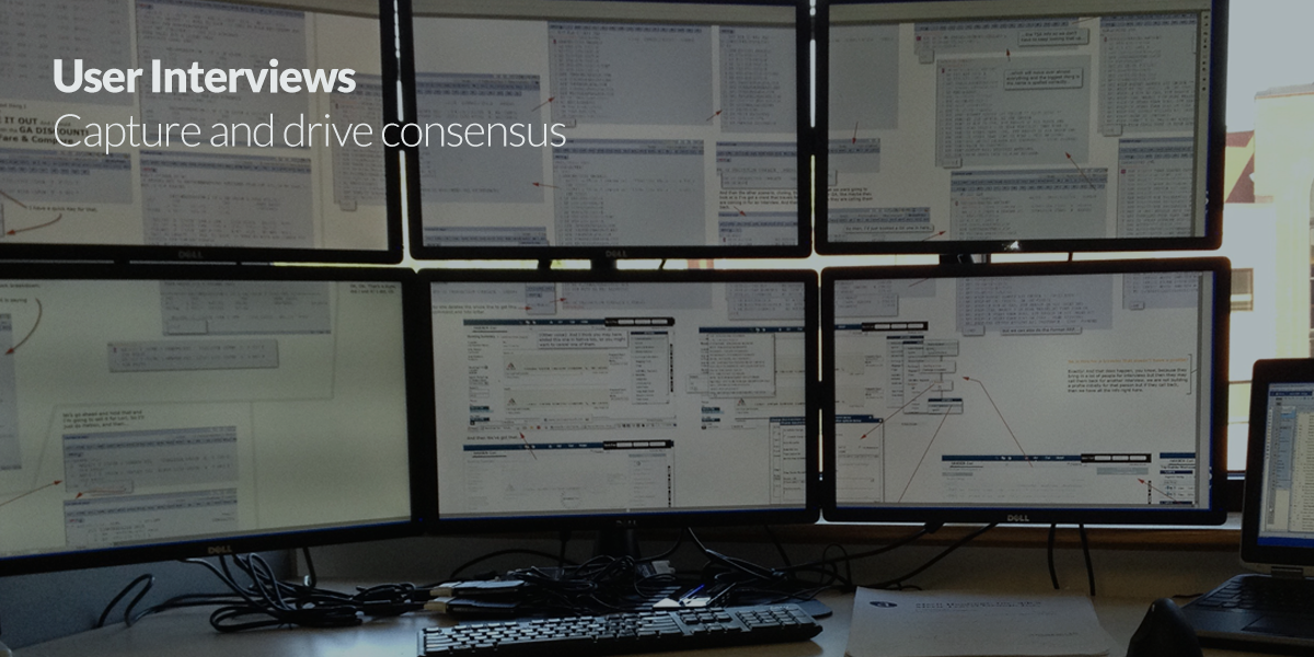
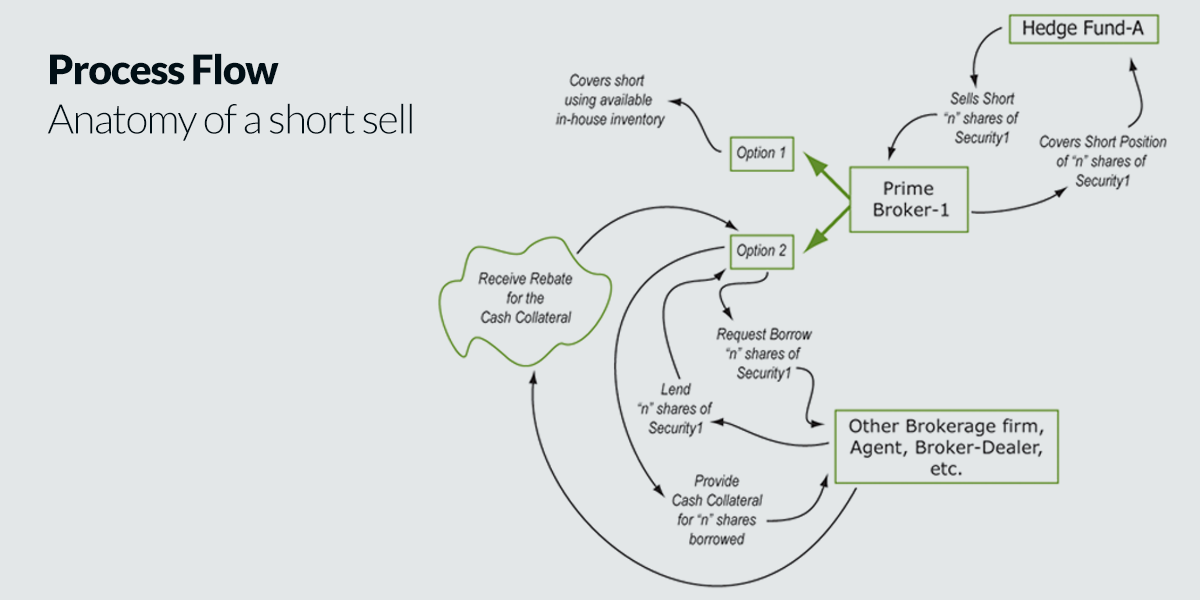
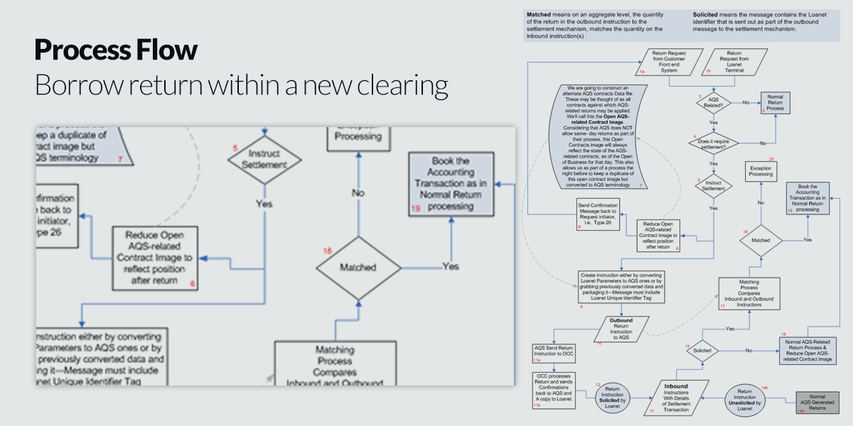
Where possible, I use everything from large plots of specialized artifacts, large display clusters, or when necessary, just sticky pads, so that stakeholders can use a visual framework with which to build consensus around function and form alike. Features and strategic decisions that emerge from consensus become easier to execute and deliver ROI more quantitatively.
The interactive site schematic is one such artifact. It shows everything that a traditional site map does and then goes beyond, to show not just what pages are connected to each other, but how they are connected, showing the artifacts of interactivity and referring to and including functional content by designation. Think of it as a wireframe for pure interaction. It’s part of a process for the display of interactivity, which I independently patented, USP 7,644,390 and 8,694,953. It also solves the problem of n-dimensional space display in two dimensions.
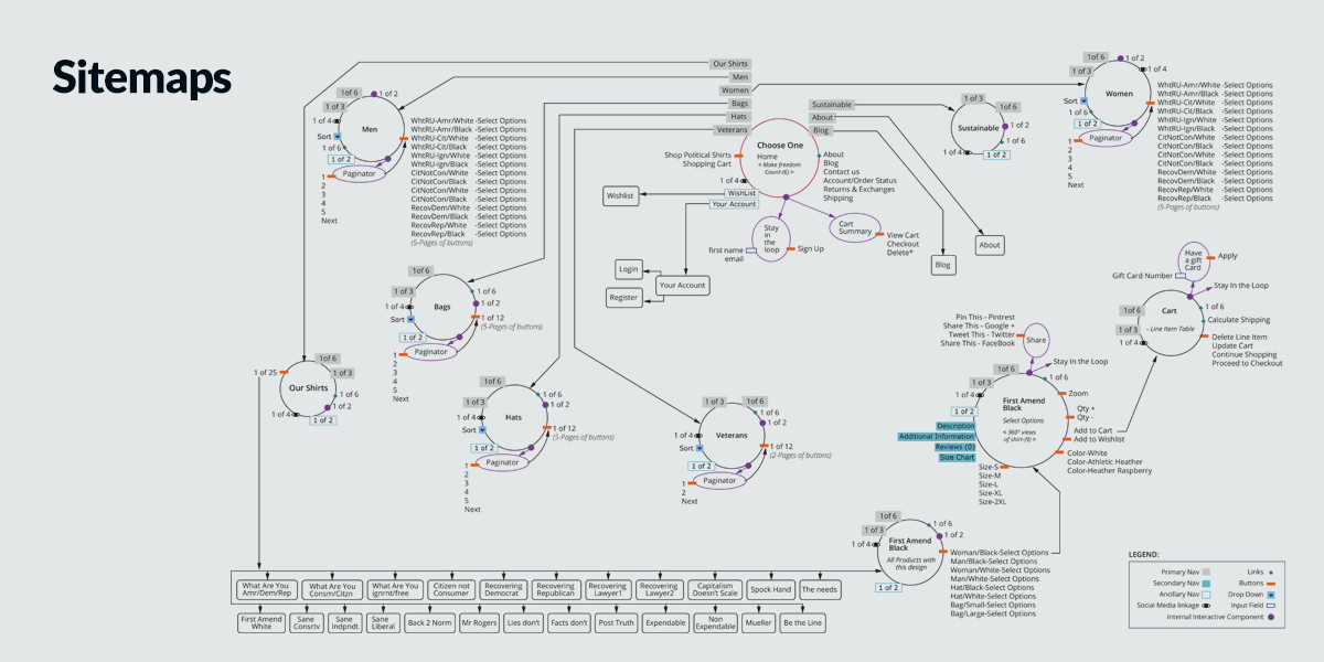
Another useful artifact to emerge from this process is the demo deconstruction schema. Let’s say there is a three-hour demo involving expert users driving complex software and talking about their interaction and how it fits in their business. How do you unwind that information and visualize it and put it up on a wall, so that the entire three-hour discussion is available at once for annotation and discussion by stakeholders? How do you interact non-linearly with linear screen time on a wall?
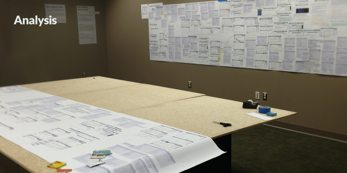
The drawings on the wall and the ones on the table are 44 x 160 inches, each contains about 45 minutes of screen time and accompanying dialog and conversation. These can be used to reinforce or counteract strategic and tactical product design decisions.
This enables the stakeholders to see and agree to massive complexity in a simple physical space which can track creative as well as strategic choices and outcomes.
Style & Art Direction
*Works shown are original commercial and gallery art
To design is to create a plan that has some intention. The intention is usually the building of a system or object that is supposed to do something useful and the plan hopefully shows you how to do it right. The usefulness can be measured so you can tell if you did it right.
In the world of visual design, entertainment, creative content presentation, industrial design and architecture, there is no design thinking. They are busy designing. An architect or industrial designer spends years in school, and many years in apprenticeship, learning about aesthetic values and the natures of form and function and design in a particular field.
Adopting design thinking isn’t about becoming that designer, because that’s not possible. It’s certainly not in the exclusive domain of experience design or of building better apps. Design thinking happens when the principles of actual design permeate a boardroom full of accountants, lawyers and MBAs trying to make critical decisions. Such a collective of business experts as investors and bankers, do not need to design or think design while doing the tactical components of their often highly technical daily jobs. The good ones already do that. But when deciding on strategy, when figuring out how to gather and respond to verifiable market requirements, how to create roadmaps for corporate direction, how to respond to market demands, when they need to make a plan and execute, then they absolutely need to think like designers. This is how the principles of visual design and creative content production, architecture and that “way of decision-making” absolutely can help make better informed, better structured, more visualizable business decisions. That’s the only way to measure if you thought like a designer.
When you get it right, users just want to grab the mouse right out of your hand and try your software. I can help you figure out how to design and build software like that.
I have designed satellite imaging software for the NSA, designed the front end for first generation web billing systems for Verizon and Vodafone, helped Merrill Lynch comply with SIFMA regulations and won an exclusive endorsement from the International Swaps and Derivatives Association.
In my experience, the hardest part of building software happens before a single line of code is written, during design, and the substance of a successful software team is commitment to communicating the many different perspectives that make up a product and its stakeholders.
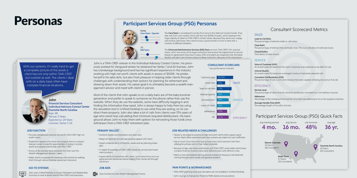
Proper design is always data-driven, market focused, and thrives in a continuous loop of market feedback. I can design and manage winning products and inspire design teams to consistently accomplish great results. I thrive on building and utilizing customer relationships to create effortless user experience.
Based in the Boston Area
(617) 513-8342
paymankhoda@yahoo.com
Product Design Innovator
With two independently patented processes for display of interactivity: USP 7,644,390 and 8,694,953.
Thought Leader
Presented at:
Innovation Enterprise Data Visualization Summit on “Qualitative Visualization, Visualizing Uncertainty.”
Global Big Data, Data Science Conference on “Emerging Markets for Enterprise Visualization.”
UXPA Boston on “Managing Complexity.”

