Created nextgen reporting systems for Sungard’s SaaS offering to securities finance operational staff. In the investment banking world securities finance is as fundamental as infrastructure. Managing the interactions between modern systems and their legacy supporting systems is a constant challenge. The workflow demands shared multi-user collaboration and communication across four time zones. While also ensuring compliance in a highly regulated, high speed environment. Two of the reporting systems included SunGard Compare and SunGard ALDoP.
Sungard Compare
Contract comparison is a regulatory compliance service for the investment banking community participating in securities finance in Europe and the United States. These two markets have fundamentally different operation and business motives.
Effectively all transactions in the US are centrally cleared and required to settle within three days and compared daily. In European markets, transactions may take some weeks to clear and settle but are also compared daily. The management of US and European comparison is then done daily through two separate dev life cycles with the same back-end process.
Our SaaS solution needed to create a front-end to this process on a new single platform in which to service both markets. In this single user interface, the experience needed to allow users to operate seamlessly within their existing workflow with no functional redundancy.
Before engagement, the team’s approach was to separate content across pages
This approach left many UX gaps and giant backlogs of apparent “feature gaps” all of which were high priority.

Goals
- Reduce navigation overhead
- Enable many-to-many associations
- Display and sort breaks according to risk
- Show aging by tracking how long a contract has been broken
- Show dividend information about a security
Key Findings
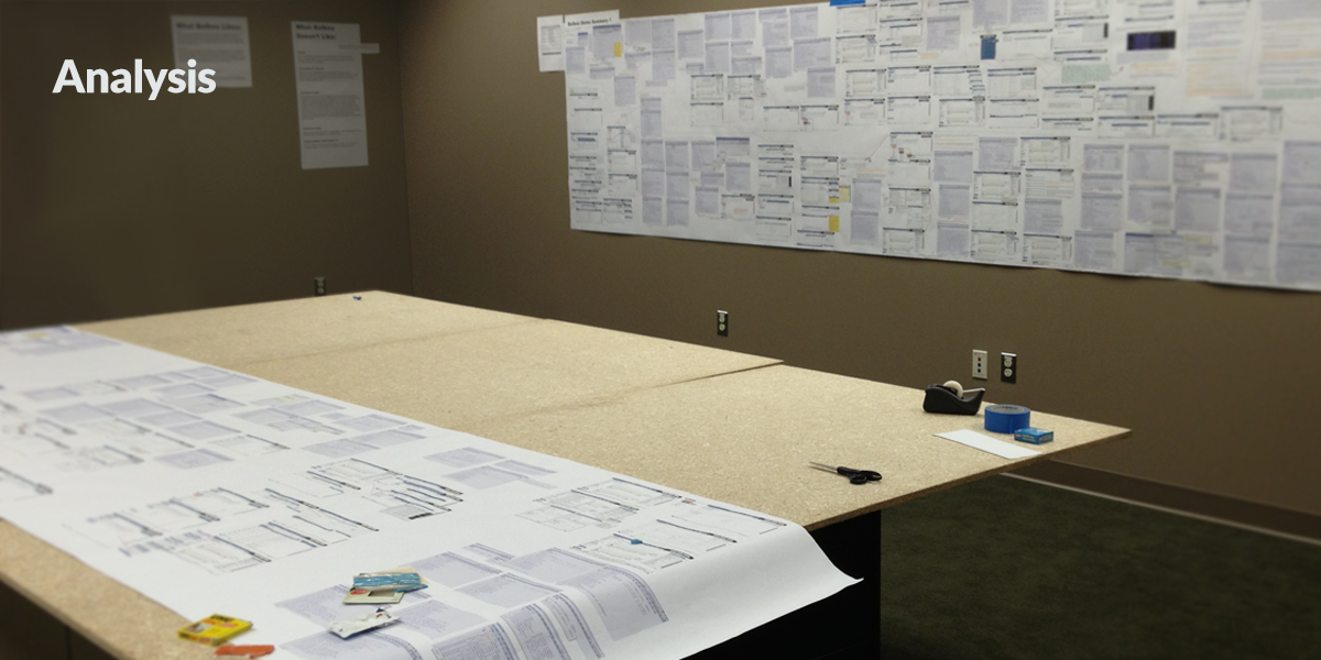
US and International customers had available a 17-column table printed on one long horizontally oriented letter size roll each block 9 by 11 inches. With a height of a great many pages. The web interface of the application intended for the international market was more popular with domestic market for a handful of features, but they were counter to European operational outcomes.
Example of Demo Deconstruction Schema
The drawings on the wall and the ones on the table are 44 x 160 inches, each contains about 45 minutes of video recorded user interviews and screens. These were used to reinforce or counteract strategic and tactical product design decisions. This enables the stakeholders to see and agree to massive complexity in a simple physical space which can track creative as well as strategic choices and outcomes.
Results
increase in European market share.
Comparison went from a 3 hour on average task to a 45 minute on average task at participating firms. A newly discovered patent-pending way to search for orphan contracts emerged from the new user interface and comparison process.

SunGard ALDoP
Broker dealer securities lending transactions are monitored for credit and capital information. The extent of disclosure on the part of agent lenders within those securities transactions raised SEC red flags. The commission was concerned about broker-dealers’ abilities to assess their exposure to underlying principal lender and only seeing exposure at the agent lender itself.
Before engagement, the team’s approach disregarded user workflows
Separating the display of data on multiple pages left many UX gaps and users would “work around” the application by downloading Excel spreadsheets and PDFs of the data.

Goals & Key Findings
Broker dealers, and agent lenders maintain their books of business differently. Here was a place where they needed to understand aspects of each other’s books. Some of the hardcopy reports containing parts of the relevant data were in auto-output pdfs up to 26,000 pages. We needed to show the intersect of four different reports of that scale in a single application space.
Examples of actual user workflows analyzed


Results
Immediate adoption
Made available as an upsell higher priced tier of service, the new product experienced immediate 100% adoption upon demonstration by all consumers of ALDoP data.


